CASE STUDYBanking Dashboard
M1 - Chicago, IL
Role: Lead Product Designer
Responsibilities: UX Design, UI collaboration with Visual Designer
Stakeholders: Design System team, Head of Design, PM, Tech Lead
Design all new landing pages for the financial products of Spend, Save + Borrow featuring clean, intuitive UI/UX that meets user expectations for financial UX.
Quarterly NPS Results
Business goal
Enhancing User Adoption and Unifying Visual Cohesion for a Premium Banking Experience
M1 was facing a challenge with user adoption of its banking product falling below targets (for reference, NPS had previously peaked at 41). Additionally, the M1 premium banking experience was not executed at the highest level, highlighting the need to enhance the overall user experience to meet company goals for revenue growth and customer retention. Thus, this project had two main goals;
Streamlining visual cohesion across all products to unify the experience of the 'financial super app' and improve user engagement.
Adapt this ongoing visual treatment specifically to the banking side of M1 clarifying information needed with intent of fortifying landing pages.
User problem
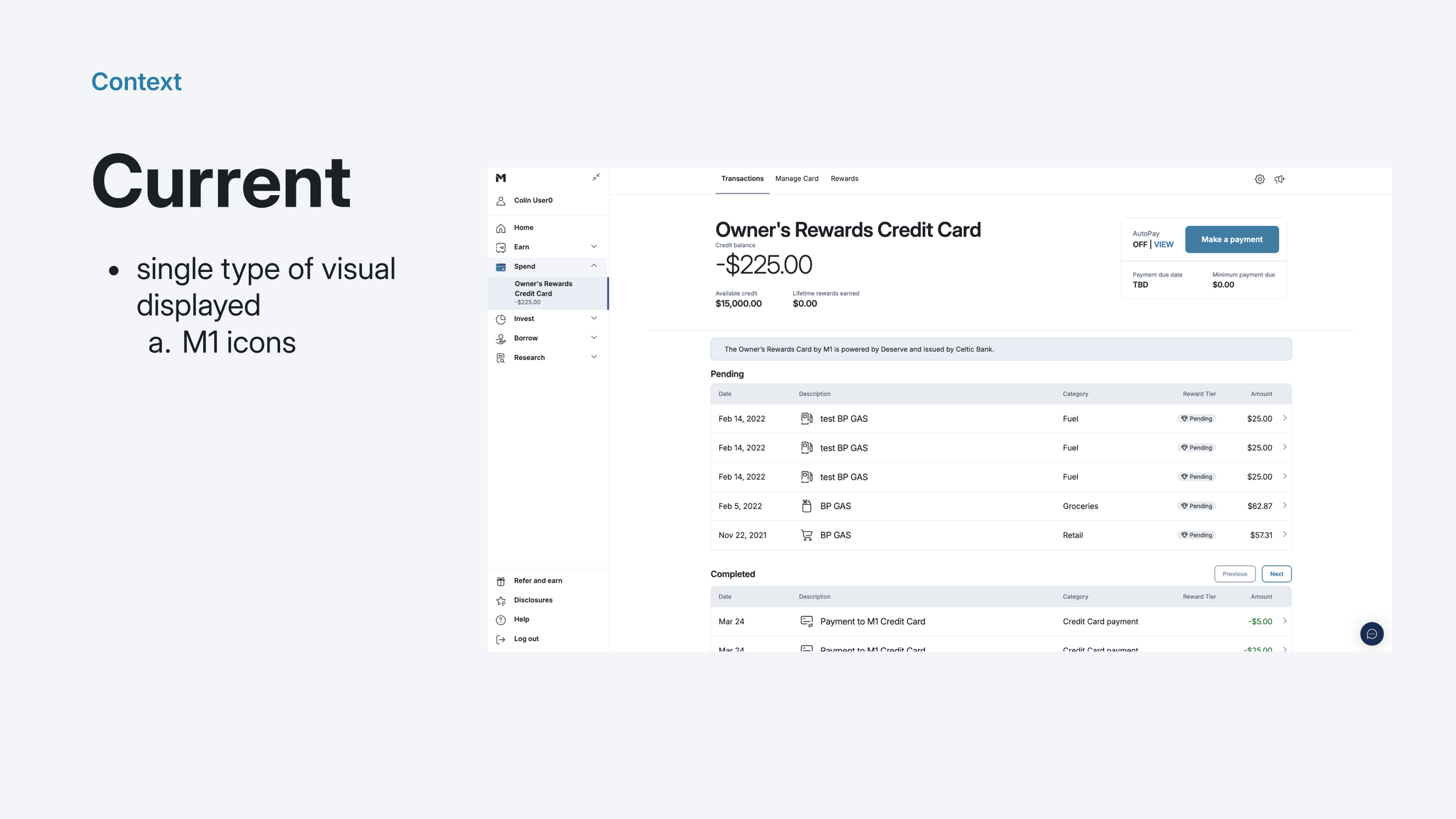
Challenges with Hidden Transaction Information and Dated Design
Users encountered frustration as vital transaction information was hidden and not contextually provided, leading to confusion and potential errors. The dated and unintuitive layout further exacerbated the usability issues, making it challenging for users to navigate and comprehend the platform efficiently. Additionally, the lack of emphasis on key information due to an overloaded interface led users to feel overwhelmed, diminishing the significance of critical details.
Data confusion is a failure of design, not an attribute of information.
-Edward Tufte
Process
Collaborative Business Requirement Exploration and Stakeholder Reviews
The project began with collaborative sessions with leadership to define business needs and requirements. Various formats for consolidating information on a single page were explored, leading to the creation of wireframes and prototypes. Multiple stakeholder reviews were conducted to gather feedback and ensure alignment with stakeholders' expectations.
Also, tight collaboration with BE engineering to uplift the way we worked with Plaid Enrich to better surface vendor logos in the transaction table for Spend. This work required a design deep dive to clearly understand options + present them to stakeholders + the team to solidify a common direction forward.

The existing transaction table at start of project, note lack of visual interest + hierarchy in table.

Clarifying intent of sub workstream for stakeholders + teammates.

Detailed breakdown of how we as a team opted to handle logos across disciplines.

Mock of proposed solution for reference + discussion.
This dev build prototype demonstrates the silky smooth motion incorporated in the transaction table details view allowing the user to maintain table context while presenting the details elegantly.
Solution
Elevating the Main Landing Page Design
Working closely with the Design System team and a Visual Designer, the main landing page underwent a transformation by incorporating refined details and enhancing the overall treatment of the product. Through collaborative efforts, the design team ensured that the landing page not only adhered to the established design system but also showcased a visually appealing and user-centric interface. By amalgamating the expertise of the Design System team with the creativity of the Visual Designer, the landing page now offers a seamless and engaging experience for users, setting a new standard for product presentation.
Impact
Enhanced User Experience Through Elegant Interface Design
By implementing an elegant interface that catered to users' information needs within their transaction register, we achieved significant improvements. The introduction of a greatly enhanced UI across three main products supported ongoing increase in user engagement. User feedback indicated a measurable rise in overall satisfaction, validating the success of the new interface design in meeting user needs effectively.
Learnings
The Vital Role of Clarity in Financial Design
The importance of clarity in financial design cannot be overstated. This case study underscores that clear and concise design is paramount, particularly in financial applications where user understanding and trust are crucial. Ensuring that complex financial information is presented in a clear and understandable manner is key to fostering user confidence and engagement.
Additionally, the emphasis on maintaining context highlights the significance of providing users with relevant information at all stages of their interaction, contributing to a seamless user experience. The resulting impact (above) supported our hypothesis that a contextual approach was expected + would be perceived as useful.
Lastly, I realize that animation is amazingly powerful as an experience + incredibly complex as a designer. Yet, the substantial effort provides very real value in the form of adoption + delight - the epitome of craft.


